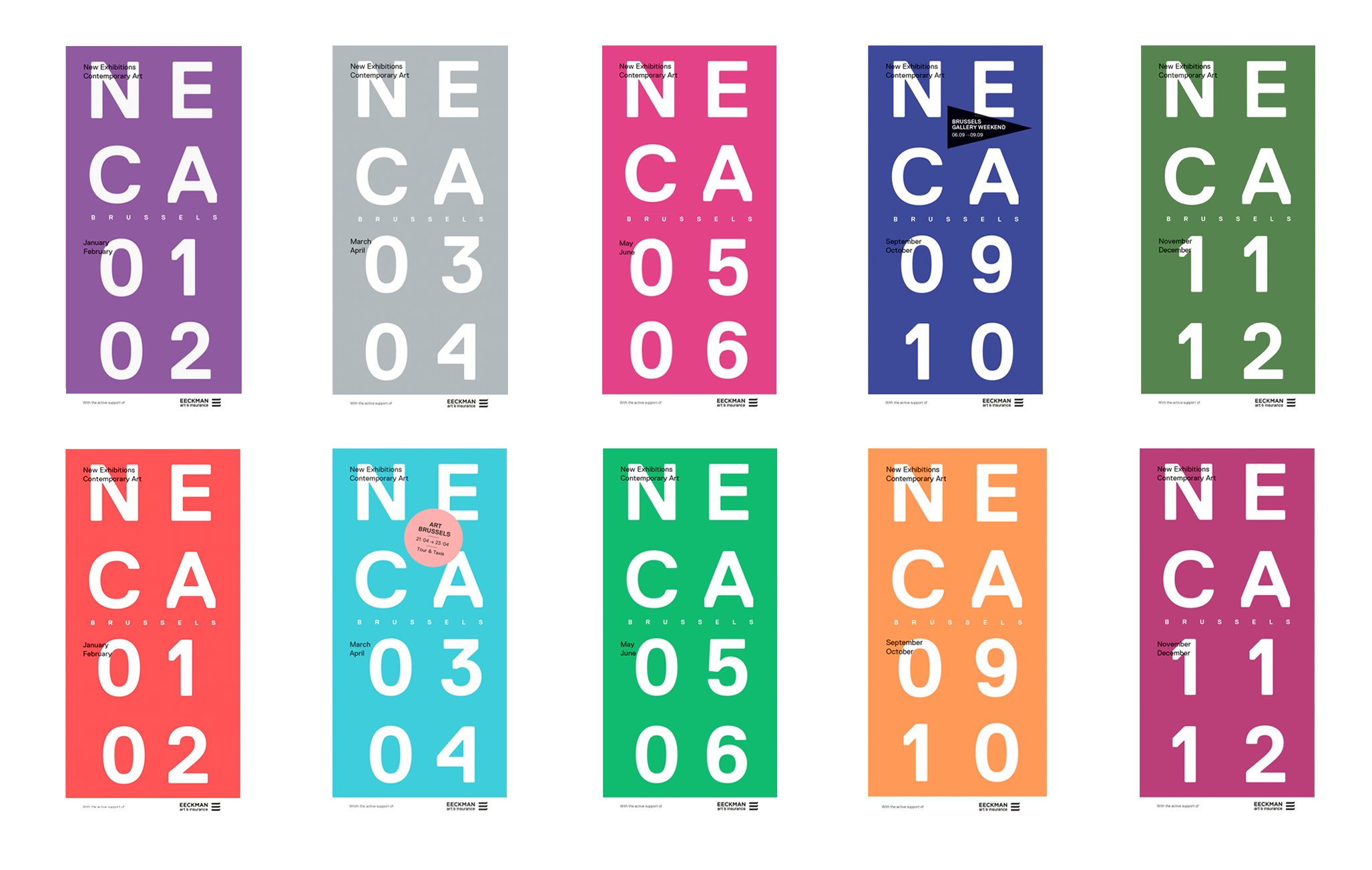
NECA
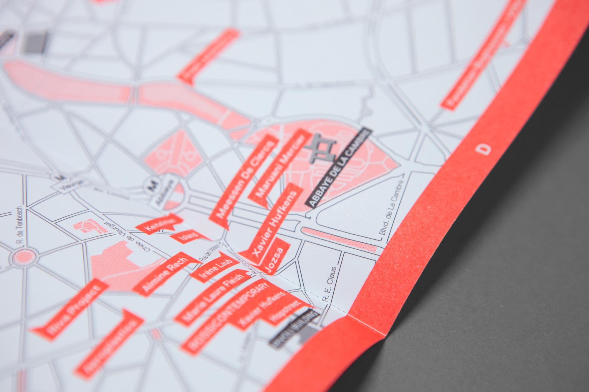
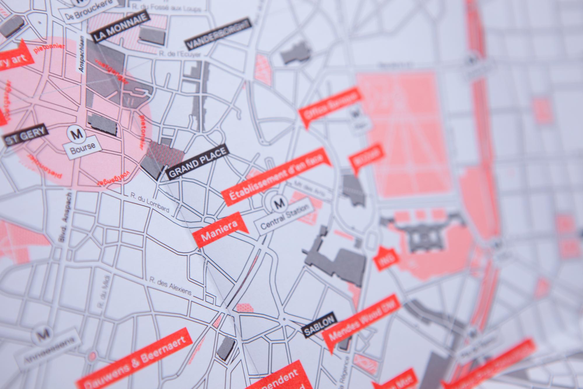
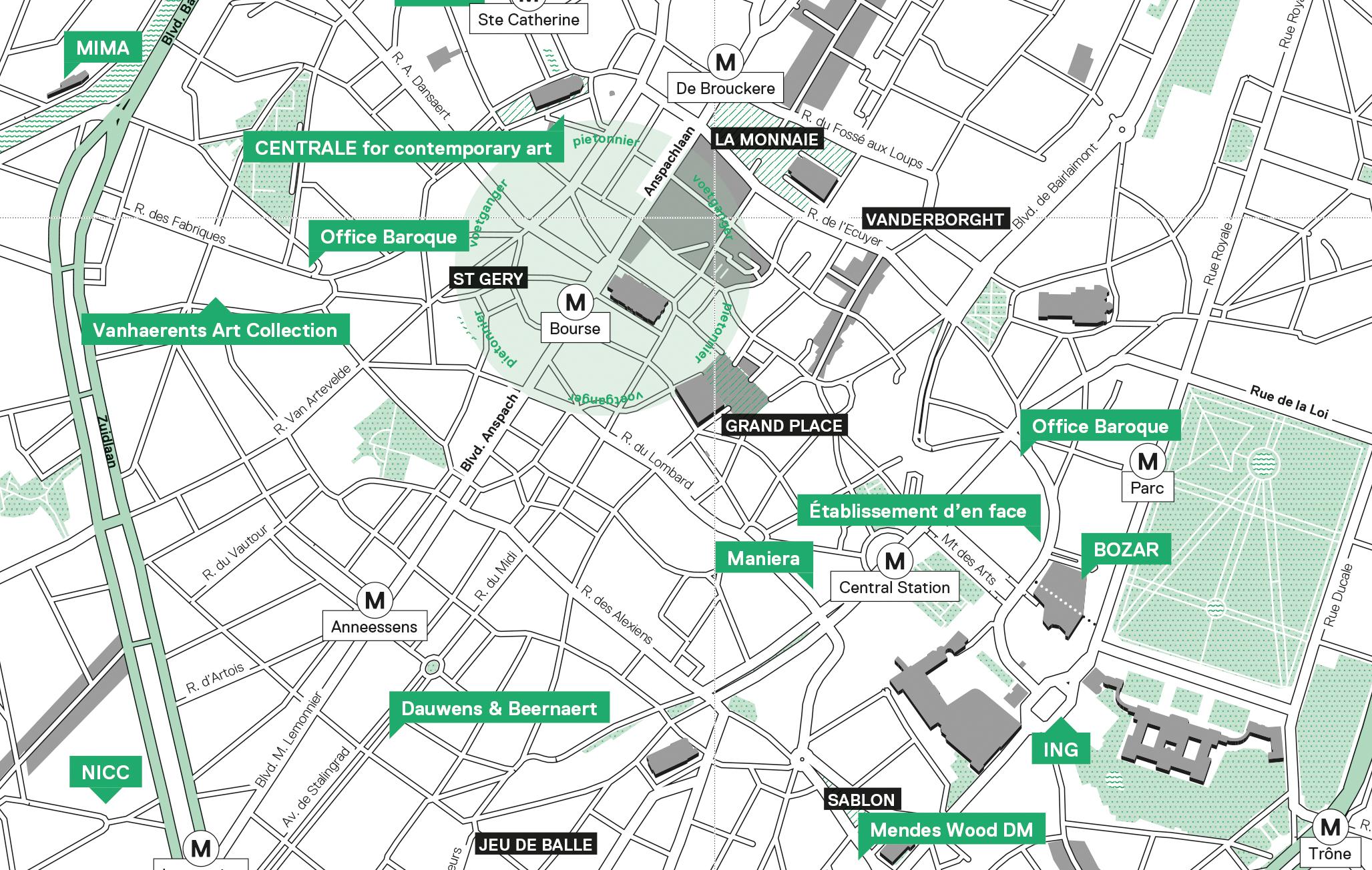
Comprehensible and comprehensive. A rigid yet minimalist grid and clear typography guide the user confidently through a wealth of data.
NECA stands for New Exhibitions Contemporary Art, and is a publication in the form of a bimonthly city map with extensive listings of all the contemporary art exhibitions, gallery shows and other events.
The challenge was to fit in a huge amount of practical information. We designed a structured grid that prioritised overview and practicality. An easily readable font and a strict and well thought out hierarchy of data added to the clarity of the design.
To make the product immediately recognisable we chose to fill the entire cover page with NECA’s typographic logo. We gave every issue a distinctive colour so that they could be easily dated and placed in the timeline.