La Piste aux espoirs
Step into the circus ring, a world of movement and magic. Welcome to the heart of a traditional art form that has undergone an extraordinary facelift in recent years.
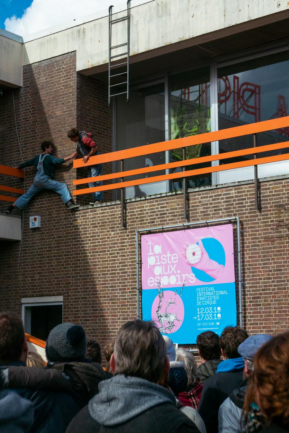
La Piste aux Espoirs is a biennial circus festival organised at the maison de la Culture in Tournai. The event is both a gathering for circus enthusiasts and a competition that has significantly gained in renown since its first edition in 1988.
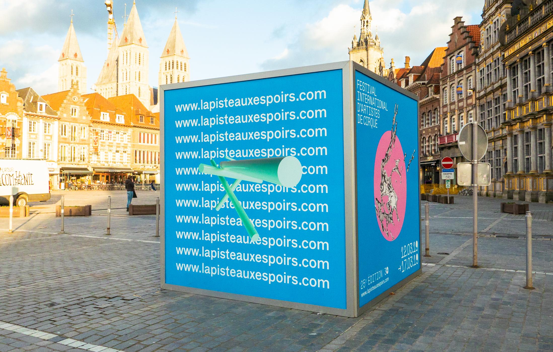
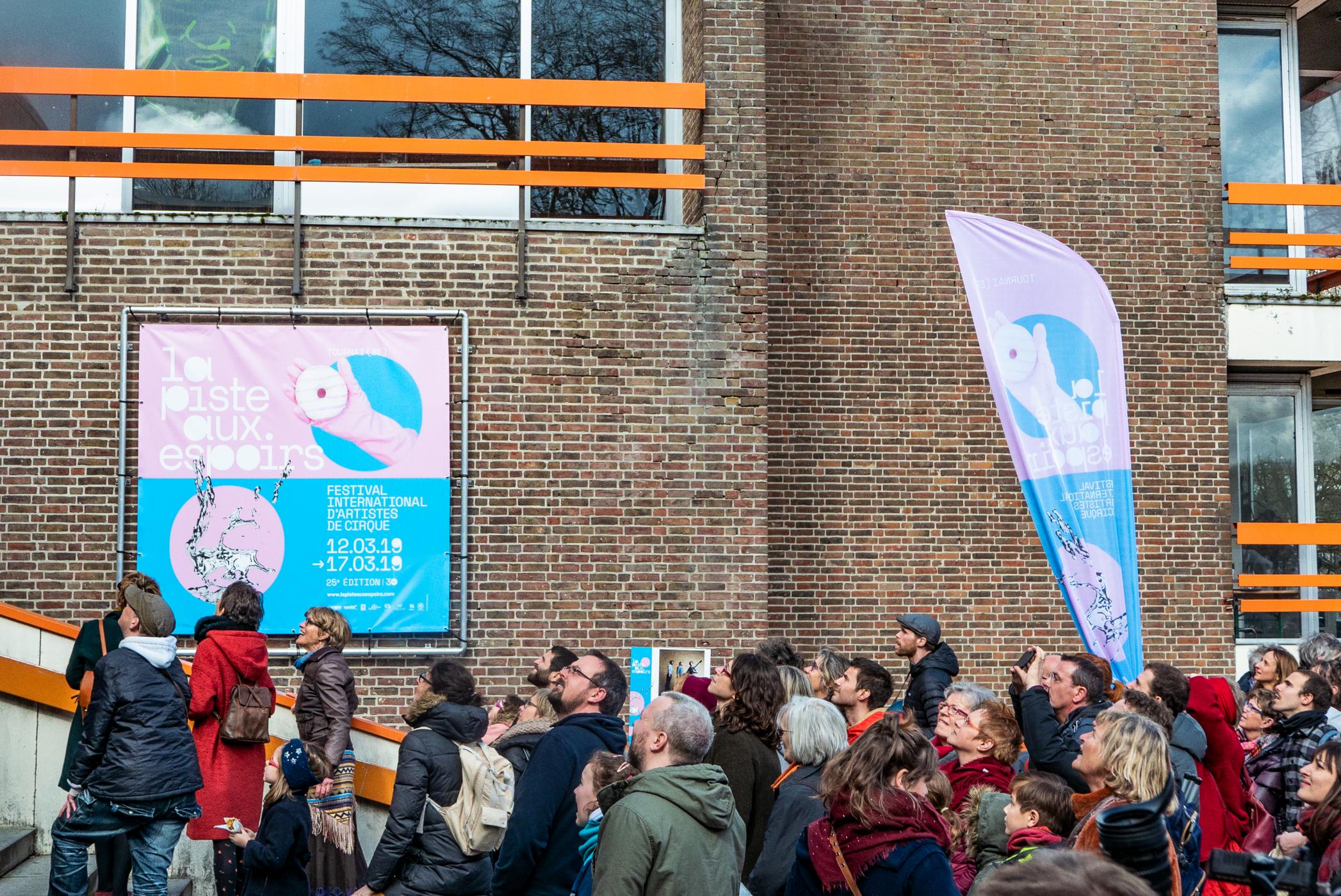
To keep up with its growing reputation but also with the changing face of the contemporary circus, the festival needed a new visual identity. Ekta was charged to honour the circus tradition and its loyal audience, while at the same time reflect the changes within the art form itself and appeal to an ever widening potential public.
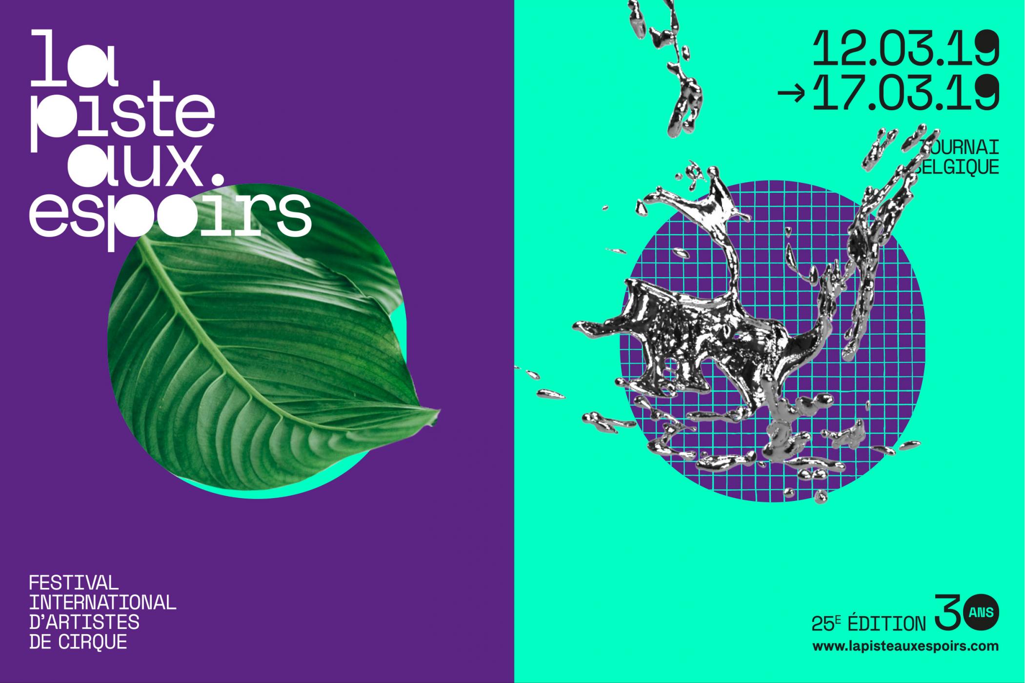
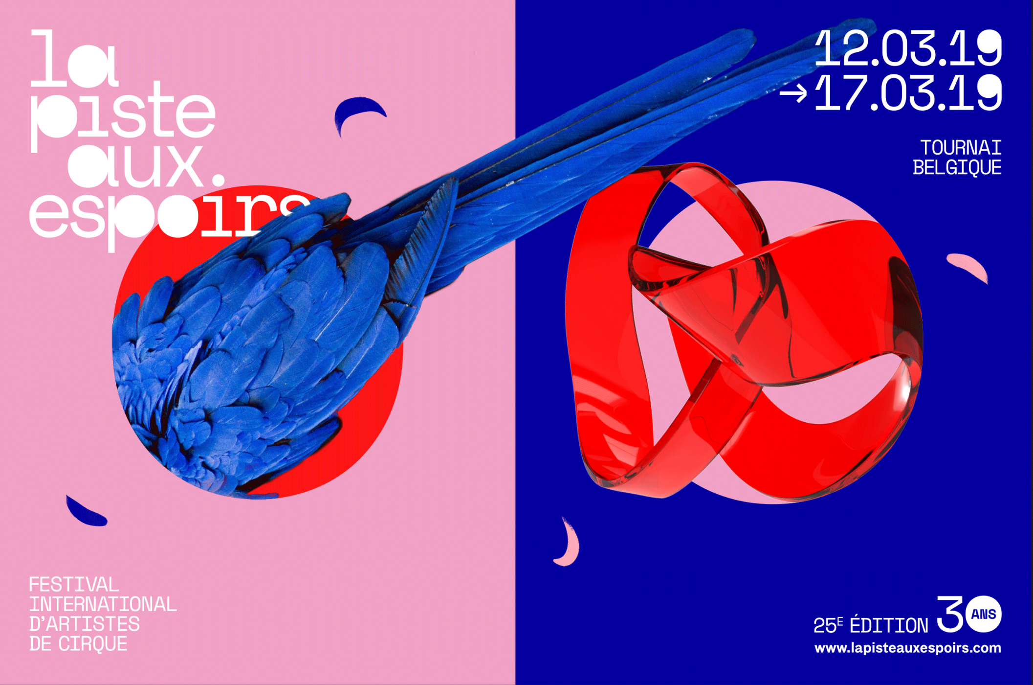
Ekta stripped the circus of all its paraphernalia and zeroed in on one iconic, traditional element: the circus ring, both a reference to the name of the event and its literal physical centre. The solid circle, as an abstraction of the circus ring, became the defining graphic element and the starting point for a whole series of off-shoots.
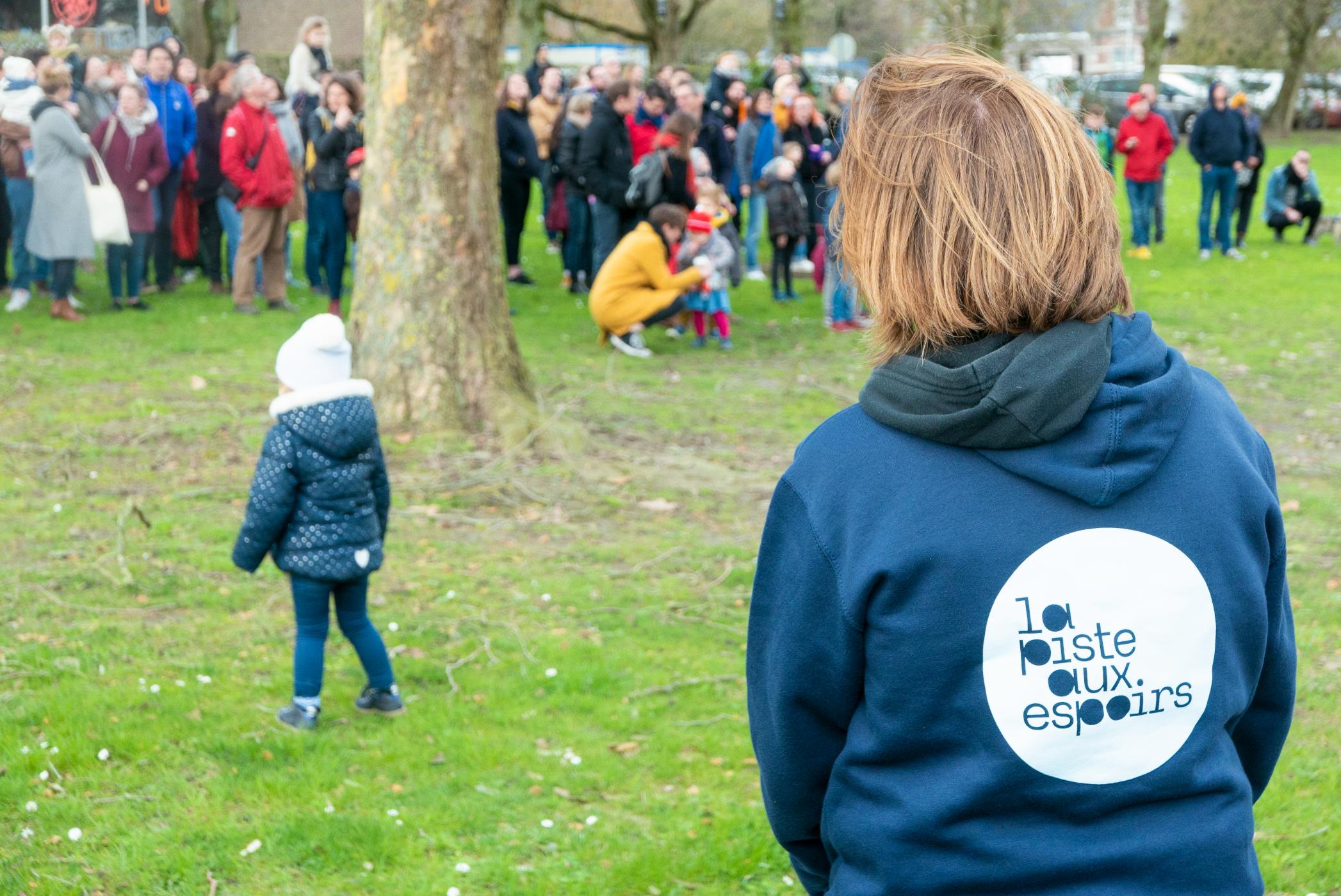
This graphic element was combined with the ‘FK Grotesk’ font, by replacing the open counters in the letters by the solid circle. The combination yields a variety of circle combinations in both typography and visuals that reference the many different disciplines within the circus and add a joyful, dynamic, and quirky character. This simple and recognisable element makes it easy to combine with different visuals and colours and create a new set of visuals for every new edition of the festival.
